

Geography is how wrong your map is
These things seriously distort the world!
Welcome to a new iteration of the podcast posts! Instead of uploading them through Substack, we have decided to instead embed both a Spotify player and the YouTube video version. This way you can watch either or both. You can also continue to listen on whatever app you prefer. Also Substack’s player is a total pain so I’m happy to not have to deal with it anymore.
Listen
Watch
📽️ YouTube: https://www.youtube.com/@geographypod
🎙️ Listen on other apps: https://linktr.ee/geographyiseverything
📷 Socials: https://linktr.ee/geographybygeoff
📖 Check out Hunter's atlas' here: https://www.indiebound.org/search/book?keys=hunter+shobe
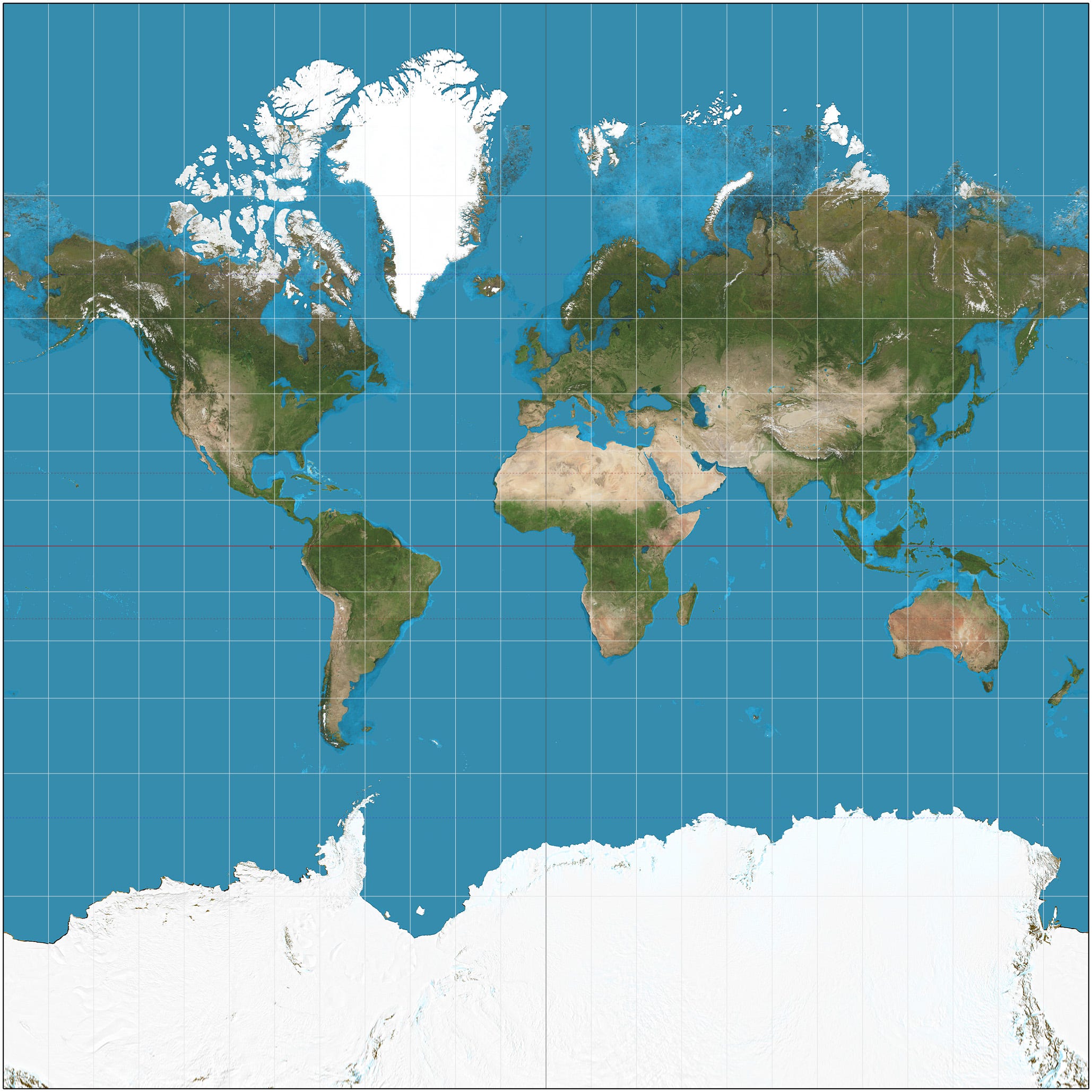
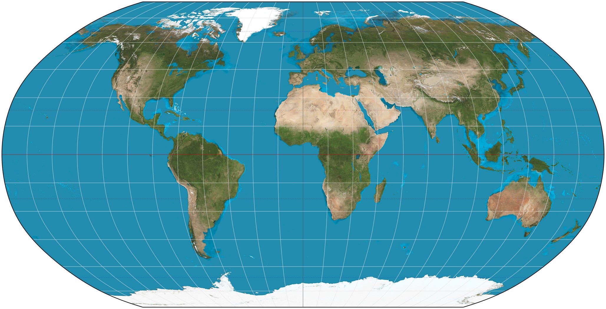
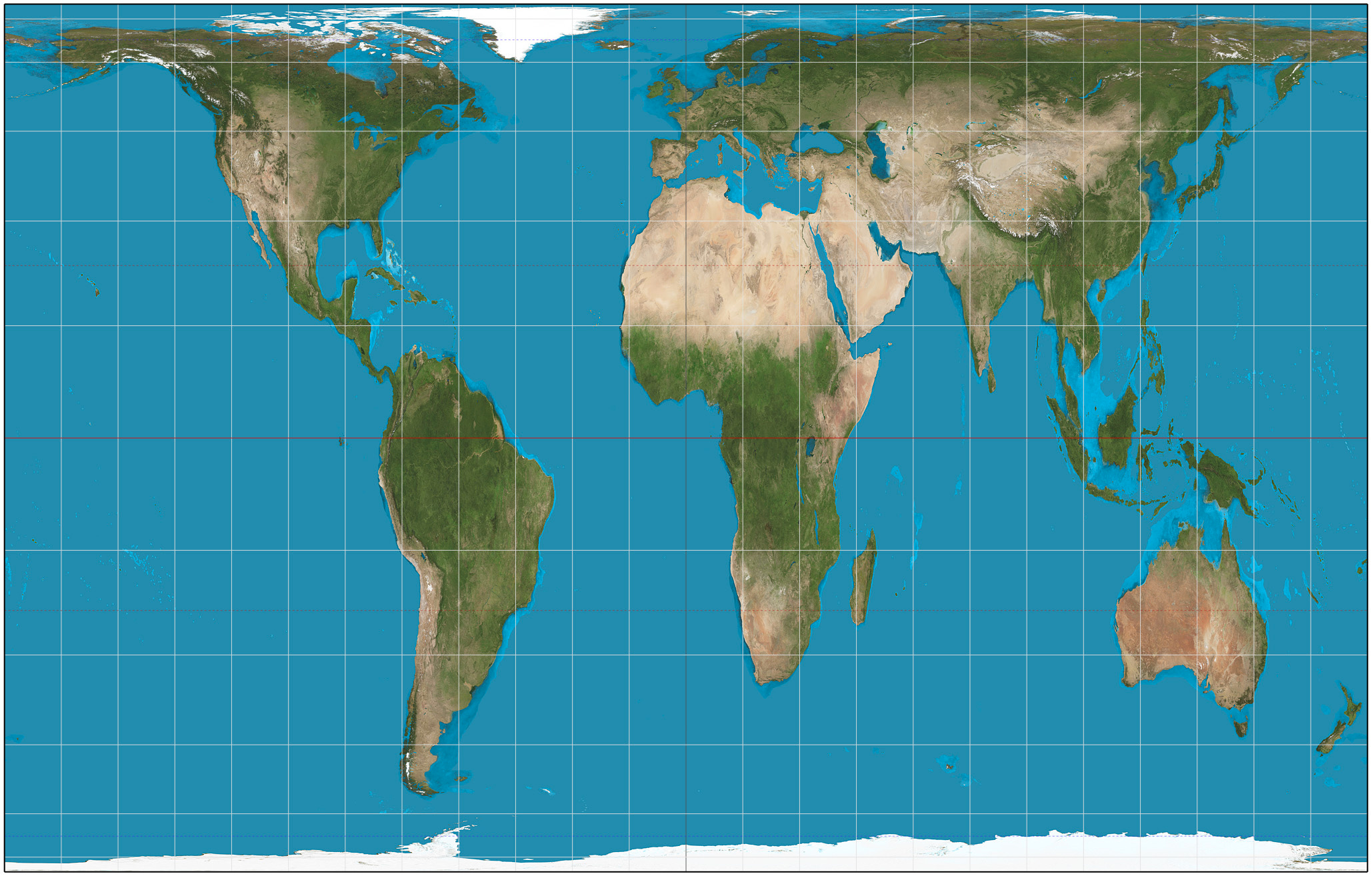
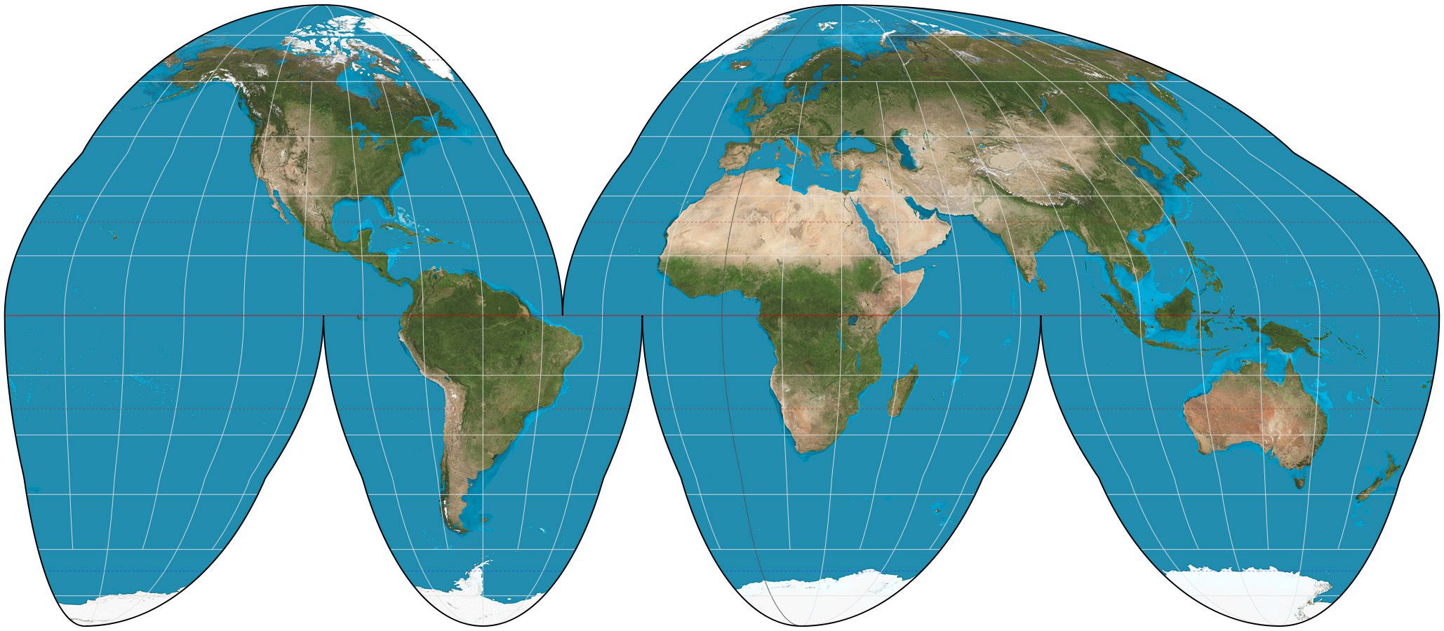
Maps distort our world. They elongate some areas and squish others. They emphasize one place at the expense of another. Even the very nature that north is up and south is down, is a myth perpetuated by the humble map. So how did we end up with maps that are so dang wrong all the time? In today's episode, we break down the history of maps, the most famous map, the Mercator, and a few other popular world maps and how each distorts the world. And why they kind of have to!
Here are the maps we discuss in the episode today:
Mercator
Robinson
Gall-Peters
Goode Homolosine
Mercator, Winkel Tripel, Robinson, Goode Homolosine projections by Strebe - Own work, CC BY-SA 3.0, https://commons.wikimedia.org/w/index.php?curid=17700069